目次
はじめに
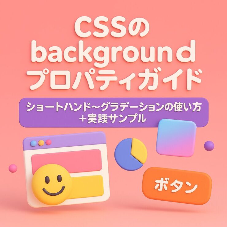
Webデザインの背景は、見た目の印象を左右する重要な要素です。
CSSの background プロパティを理解すれば、単なる色指定だけでなく、画像やグラデーションなど装飾的な背景まで表現できるようになります。
本記事では、基本のプロパティ一覧 → グラデーション解説 → 実践的なデザイン例 の順にまとめました。
初級者から中級者まで役立つ内容になっています。
基本的なbackgroundプロパティ一覧
| プロパティ | 説明 | 使用例 |
|---|---|---|
background-color | 背景色を指定 | background-color: #f0f0f0; |
background-image | 背景画像やグラデーションを指定 | background-image: url(bg.png); |
background-repeat | 画像の繰り返し方法 | repeat / no-repeat / repeat-x / repeat-y |
background-position | 画像の配置位置 | center center, top right |
background-size | 画像の表示サイズ | cover / contain / 100px auto |
background-attachment | 背景をスクロール固定するか指定 | scroll / fixed / local |
background-clip | 背景の描画範囲を制御 | border-box / padding-box / content-box |
background-origin | 背景画像の基準位置を指定 | border-box / padding-box / content-box |
background-blend-mode | 背景の合成モード | multiply / screen / overlay |
backgroundショートハンド
ショートハンドとは?
CSSには「ショートハンド(shorthand)」と呼ばれる省略記法があります。
本来は複数のプロパティを個別に書くところを、1つの background プロパティにまとめて書けるのが backgroundショートハンド です。
例:個別に書いた場合
.box {
  background-color: #333;
  background-image: url(bg.png);
  background-repeat: no-repeat;
  background-position: center center;
  background-size: cover;
  background-attachment: fixed;
}
例:ショートハンドでまとめた場合
.box { background: url(bg.png) no-repeat center/cover fixed #333; }
たった1行で同じ意味を表現できるので、コードがスッキリするけど、可読性は低いので一人で作るのかチームで作るのかによって使い分けれるようにしておくのが良いかと。
backgroundショートハンドで指定できる8つのプロパティ一覧
| プロパティ | 説明 | 記述例 | デフォルト値 |
|---|---|---|---|
| background-image | 背景に表示する画像やグラデーションを指定 | url(bg.png) / linear-gradient(to right, red, blue) | none |
| background-position | 背景画像の表示位置 | center center / top right | 0% 0%(左上) |
| background-size | 背景画像のサイズ(※ position の後ろに / を付けて書く) | cover / contain / 100px auto | auto auto |
| background-repeat | 背景画像の繰り返し方法 | repeat-x / no-repeat | repeat |
| background-attachment | 背景をスクロールに追従させるか固定するか | scroll / fixed / local | scroll |
| background-origin | 背景画像の基準位置を指定 | padding-box / border-box | padding-box |
| background-clip | 背景を描画する範囲を指定 | border-box / content-box | border-box |
| background-color | 背景色を指定 | #fff / rgba(0,0,0,0.5) | transparent |
書き方のコツ
順不同だけど、以下の流れで書くと理解しやすいかなと。
background: [image] [repeat] [position]/[size] [attachment] [origin] [clip] [color];
省略したものはデフォルト値が自動適用される。
background-size だけは必ず position の直後に / で区切って書く
ショートハンドは 8つのプロパティをまとめて指定可能
省略時のデフォルト値を把握しておくと安心
グラデーションの種類
1. linear-gradient
直線方向に色が変化するグラデーション。
background-image: linear-gradient(to right, #ff7e5f, #feb47b);
2. radial-gradient
放射状に広がるグラデーション。
background-image: radial-gradient(circle, #6a11cb, #2575fc);
3. conic-gradient
角度に沿って色が変化するグラデーション。
background-image: conic-gradient(red, yellow, green);
実際に使えるデザインサンプル集
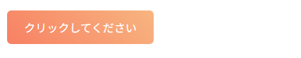
サンプル① グラデーションボタン
おしゃれなCTAボタンによく使われます。
HTML
<button class="button">クリックしてください</button>CSS
.button {
  background: linear-gradient(45deg, #ff7e5f, #feb47b);
  color: white;
  padding: 12px 24px;
  border-radius: 6px;
  border: none;
  cursor: pointer;
}
.button:hover {
  background: linear-gradient(45deg, #feb47b, #ff7e5f);
}
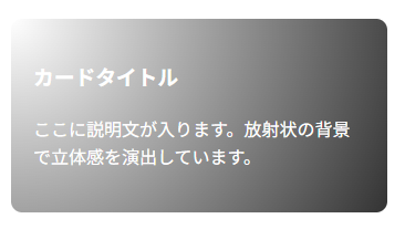
サンプル② カード背景(光の演出)
radial-gradient を使って光が当たったような雰囲気を出せます。
HTML
<div class="card">
  <h2>カードタイトル</h2>
  <p>ここに説明文が入ります。放射状の背景で立体感を演出しています。</p>
</div>
CSS
.card {
  width: 300px;
  padding: 20px;
  background: radial-gradient(circle at top left, rgba(255,255,255,0.5), #333);
  color: white;
  border-radius: 10px;
}
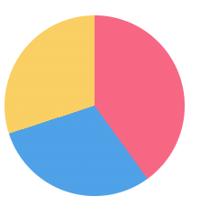
サンプル③ パイチャート風デザイン
conic-gradient で簡易的なグラフ表現も可能。
HTML
<div class="chart"></div>CSS
.chart {
  width: 200px;
  height: 200px;
  border-radius: 50%;
  background: conic-gradient(
    #ff6384 0% 40%,
    #36a2eb 40% 70%,
    #ffce56 70% 100%
  );
}
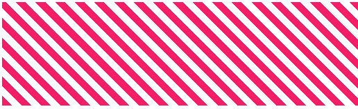
サンプル④ ストライプ背景
repeating-linear-gradient を使えばパターン模様も作れます。
HTML
<div class="stripe"></div>CSS
.stripe {
  background: repeating-linear-gradient(
    45deg,
    #f06,
    #f06 10px,
    #fff 10px,
    #fff 20px
  );
  height: 150px;
}
グラデーション比較まとめ
| 関数 | 特徴 | サンプル用途 |
|---|---|---|
linear-gradient | 直線的に色が変化 | バナー、ボタン |
radial-gradient | 放射状に広がる | 光の演出、カード背景 |
conic-gradient | 角度に沿って変化 | パイチャート、装飾背景 |
repeating-gradient | 繰り返し模様を生成 | ストライプ、パターン背景 |
📄 デモHTMLファイル
backgroundプロパティ+グラデーション実践サンプルとして作成しました。
HTMLファイルにコピペして動作確認してみてください。
値を変更してみて色々と試してみると面白いですよ。
<!DOCTYPE html>
<html lang="ja">
<head>
  <meta charset="UTF-8">
  <meta name="viewport" content="width=device-width, initial-scale=1.0">
  <title>CSS background 実践サンプル集</title>
  <style>
    body {
      font-family: Arial, sans-serif;
      margin: 20px;
      line-height: 1.6;
    }
    h1, h2 {
      color: #333;
    }
    section {
      margin-bottom: 40px;
    }

    /* --- サンプル① グラデーションボタン --- */
    .button {
      background: linear-gradient(45deg, #ff7e5f, #feb47b);
      color: white;
      padding: 12px 24px;
      border-radius: 6px;
      border: none;
      cursor: pointer;
      font-size: 16px;
    }
    .button:hover {
      background: linear-gradient(45deg, #feb47b, #ff7e5f);
    }

    /* --- サンプル② カード背景 --- */
    .card {
      width: 300px;
      padding: 20px;
      background: radial-gradient(circle at top left, rgba(255,255,255,0.5), #333);
      color: white;
      border-radius: 10px;
    }

    /* --- サンプル③ パイチャート風デザイン --- */
    .chart {
      width: 200px;
      height: 200px;
      border-radius: 50%;
      background: conic-gradient(
        #ff6384 0% 40%,
        #36a2eb 40% 70%,
        #ffce56 70% 100%
      );
    }

    /* --- サンプル④ ストライプ背景 --- */
    .stripe {
      background: repeating-linear-gradient(
        45deg,
        #f06,
        #f06 10px,
        #fff 10px,
        #fff 20px
      );
      height: 150px;
      width: 100%;
    }
  </style>
</head>
<body>

  <h1>CSS background 実践サンプル集</h1>
  <p>CSSの <code>background</code> プロパティを活用した実践例をまとめました。</p>

  <!-- サンプル① -->
  <section>
    <h2>サンプル① グラデーションボタン</h2>
    <button class="button">クリックしてください</button>
  </section>

  <!-- サンプル② -->
  <section>
    <h2>サンプル② カード背景(光の演出)</h2>
    <div class="card">
      <h3>カードタイトル</h3>
      <p>ここに説明文が入ります。放射状の背景で立体感を演出しています。</p>
    </div>
  </section>

  <!-- サンプル③ -->
  <section>
    <h2>サンプル③ パイチャート風デザイン</h2>
    <div class="chart"></div>
  </section>

  <!-- サンプル④ -->
  <section>
    <h2>サンプル④ ストライプ背景</h2>
    <div class="stripe"></div>
  </section>

</body>
</html>
まとめ
- CSSの
backgroundプロパティは背景を自在にコントロールする基礎 - グラデーションは linear / radial / conic / repeating を押さえればOK
- 実際のデザイン例を試すと、背景表現の幅が一気に広がる
ぜひこの記事のサンプルをコピーして、ボタン・カード・装飾に活用してみてください。